
GLOBAL RECESSION RISKS ARE RISING
December 8, 2015
Last month, I discussed
how risk was rising instead of declining even though the markets had a
nice bounce off the August lows.
Risk continues to rise as probabilities are increasing that this
global slowdown may develop into a global recession.
As recession probabilities are rising, the Federal Reserve is on
track to raise rates next week for the first time in over nine years.
As usual, they are focused on lagging indicators such as the
recent employment report instead of leading indicators.
I believe the Fed
should not have gone down this path of zero rates and money printing but
this is about dealing with what the Fed is likely to do instead of what
they should do. Also, I
continue to think that either they will not raise rates next week or if
they do, the market will view it as a policy mistake afterward and they
will ultimately reverse course, as we are likely headed toward negative
rates and more money printing sometime in the New Year.
Right now, it looks more like the second scenario and that they
will raise rates. We may
hear a lot about the year 1937 next year from the pundits on CNBC.
First, let’s take a
look at the average time between recessions in the chart below.
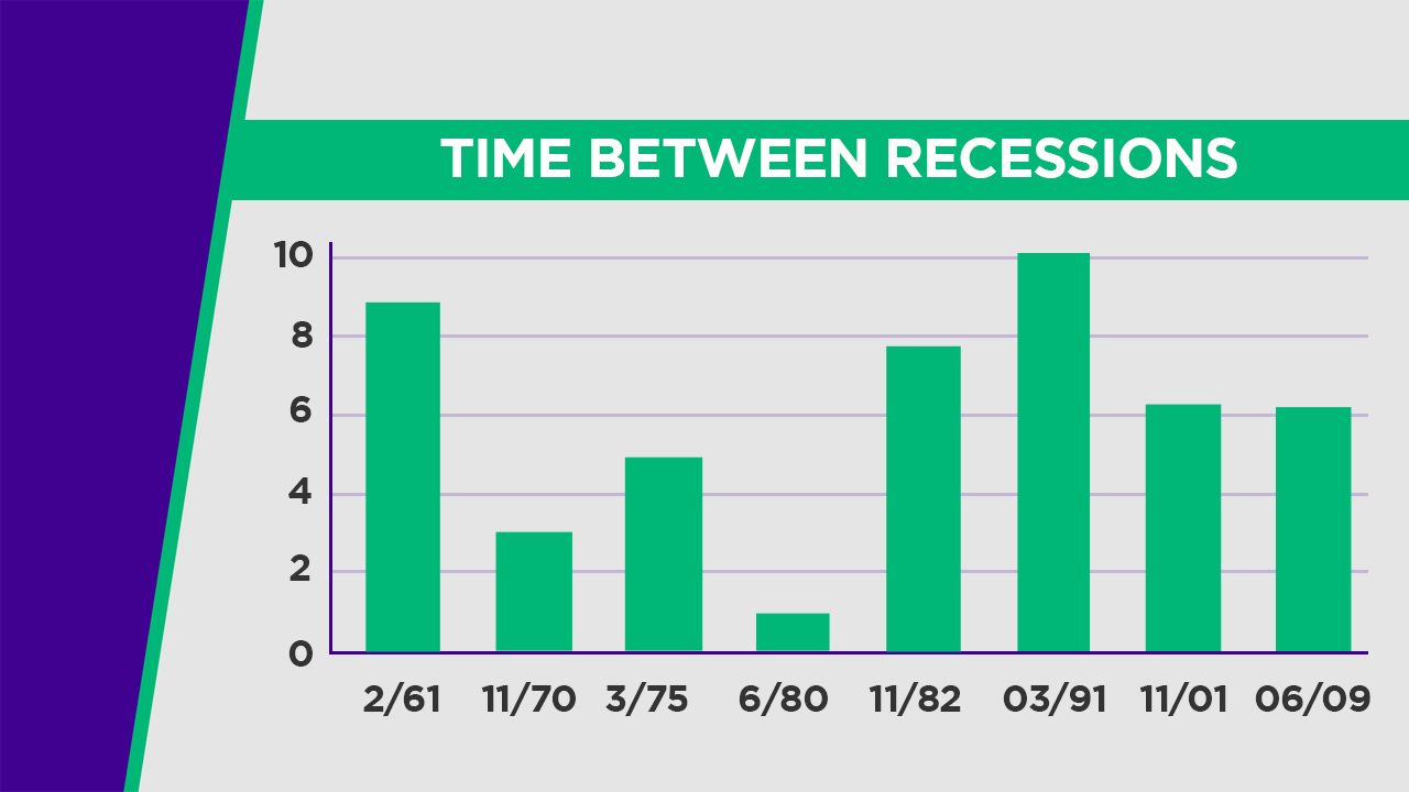
If you look at the
chart above, draw a line across at the six year mark and you can see
that it is about the average time.
The last recession ended in 2009 which happens to be a little
over six years. So, that
suggests just from a time perspective that it would not be unusual to
see another one in the near future.
If we just look at some
of the latest data on the manufacturing sector and the service sector,
we see growing weakness.
The ISM manufacturing index just reported a drop down to 48.6% with new
orders and production contracting.
A 50% reading is the break line between growth and contraction.
It was a surprise to the market that it dropped that low from a
reading of 50.1% the prior month.
The ISM services index also came in weaker than what was
expected. It was 55.9%
which still indicates expansion but it dropped from 59.1% the prior
month. Usually the
manufacturing sector leads the service sector regarding turning points in
the economy.
THE YIELD CURVE IS
FLATTENING…
Next, let’s look at the
yield curve or the spread between two-year Treasury yields and ten-year
Treasury yields. Often the
yield curve flattens or inverts as the economy slows or enters a
recession. Here is the
latest view of this spread.
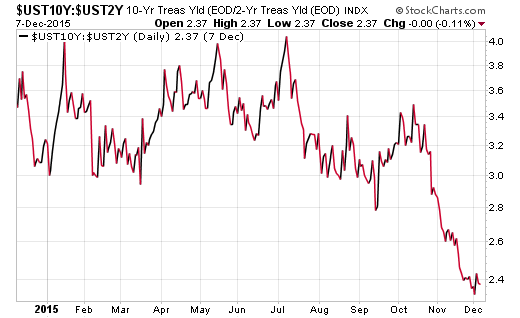
You can see that just
in the last two months, the spread has taken a notable decline.
The short-term rates have been rising as investors believe the
Fed is going to raise rates next week while the longer-term rates are
not moving up as they typically reflect more of a view on the economy.
CORPORATE PROFITS ARE COMING
UNDER PRESSURE…
Last month, I showed
how profit margins were rolling over from an all-time high.
In that chart it highlighted that the only time profit margins
declined by 60 basis points or more without the economy either in or
just prior to a recession was in 1985.
This occurred around all six recessions since the early 1970’s
and now they have rolled over by more than the 60 basis points.
Next, let’s look at a
forecast by J.P. Morgan of corporate profits relative to GDP.
In the chart below, the blue line represents their forecast of
corporate profits as a percent of GDP based on comparing wages in the
U.S. to GDP. The black line
is actual corporate profits as a percent GDP.
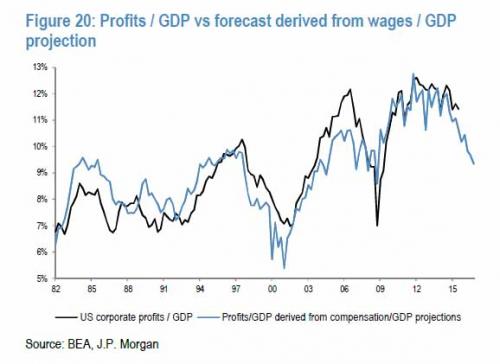
If you look at the
chart above, the blue line [forecast line] tends to lead the black line
[actual corporate profits/GDP] both on the way up and the way down.
You can see how both turned down ahead of the recession in
‘01/’02 and ‘07/’09.
Recently, the forecast line has turned down sharply and suggests that
corporate profits will follow.
This would also indicate rising recession risk.
To illustrate in
another view what is happening with corporate profits, here is chart
which shows year-over-year profits for both large and small companies.
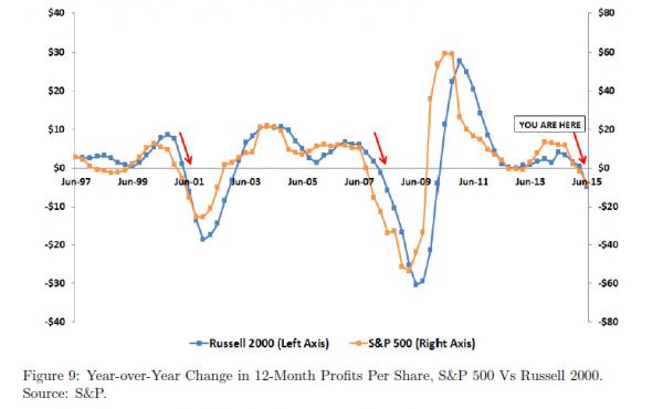
The chart above shows
profits for the S&P 500 [large companies] in yellow and for the Russell
2000 [small companies] in blue.
If you look back to the recession beginning in ’01 and the one
beginning in ’07, you see corporate profits decisively roll over into
negative territory. It is
just the past two reporting periods where profits are rolling over into
negative territory now.
CORPORATE BALANCE SHEETS
SHOWING INCREASED STRESS…
I recently highlighted
how Goldman Sachs has been discussing the deterioration in corporate
balance sheets. Let’s look
at the two charts below to see an emerging trend.
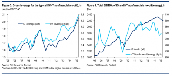
In both charts above,
the light blue line represents companies in the high yield space [ex.
utilities/energy] which have higher credit risk.
The darker blue line reflects companies in the investment grade
category with lower credit risk.
The first chart shows the median debt-to-EBITDA [cash flow].
It indicates how companies have been leveraging up relative to
their available cash flow.
The second chart shows total EBITDA [cash flow] and you can see how it
is rolling over. Also, in
the second chart, look how the investment grade companies’ cash flow
turned down in the last recession during ‘08/’09 and we are currently
seeing the largest drop since then.
I have discussed how
capital spending has been very muted during this recovery and companies
have been issuing debt to fund buybacks.
Let’s look at the chart below to illustrate this trend.
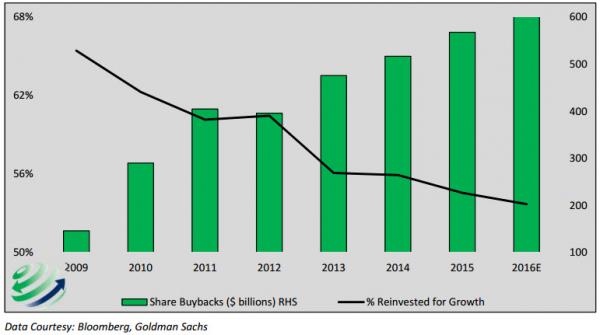
In the chart above, you
can see how since the last recession, companies have been increasing
their buybacks which is reflected in the green bars.
Also, the amount companies are reinvesting for growth is
indicated by the black line.
This shows that companies are finding little opportunity for
investing in future growth so they are buying back stock to inflate
earnings per share. This
will likely become an issue as their debts are rising, cash flow rolling
over and they have been buying back stock instead of investing in
projects that generate future cash flow to service the rising debt.
Along these lines,
let’s take a look at the corporate financing gap.
This measures the difference between cash flow coming in and the
cash flow needed to support the outflow which is spent on dividends,
buybacks and capital spending.
The chart below shows the financing gap with the black line and
previous recessions in the shaded blue areas.
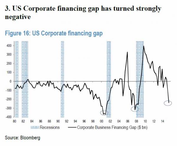
You can see in the
chart above how the financing gap rolled over notably before the ‘01’02
recession and again before the last recession.
Now, once again, we see the corporate financing gap take a sharp
decline recently and it suggests a rising risk of recession.
HIGH YIELD BOND SPREADS ARE
INDICATING RISING RISK…
Next, let’s see what is
happening with high yield bond spreads.
These reflect companies that have higher credit risk and they are
helpful to watch since they typically come under pressure ahead of
economic slowdowns or recessions.
As economic growth slows, the cash flows of companies also slow
down or decline and those companies that have higher levels of debt face
increasing challenges in servicing their debt.
As the market begins to price in increased default risk, yields
on the bonds of those companies increase as investors require higher
returns for buying or holding the bonds.
High yield spreads
often lead both the economy and stock prices.
So, here is a chart of high yield spreads compared to stock
prices. Since the energy
sector is under unusual pressure now, this chart excludes the energy
sector so it does not artificially skew what is going on in the overall
high yield market. In the
chart, the high yield spread is inverted so when the blue line in the
chart turns down, high yield spreads are rising.
Stock prices are indicated by the black line.
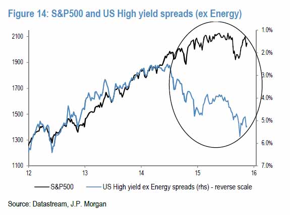
You can see in the
chart above how there is a growing gap between stock prices and high
yield spreads. We saw a
similar divergence early on before the recession that began in November
of ’07 and the related decline in stocks.
GLOBAL FX RESERVES ARE
DECLINING SHARPLY…
Before I close, let’s
look at one last interesting development with global foreign exchange
reserves. Foreign exchange
reserves reflect the amount of reserve currencies [primarily the dollar]
held by global central banks.
As capital flows freely into areas of growth around the world it
usually is associated with expanding global GDP and rising global stock
prices. And, when capital flees
prior growth areas and reverts back to safe havens like the U.S. it is
often associated with slowing global economic growth and declining
global stock prices. Just
this past month, China posted its third-largest decline on record in
their foreign exchange reserves.
We are seeing this in many other emerging market countries.
Now, let’s take a look
at the chart below which shows global foreign exchange reserves with the
dark blue line in both graphs.
In the first graph, the grey line is the year-over-year change in global
stock prices and in the second graph, the grey line is the
year-over-year change in global net GDP.
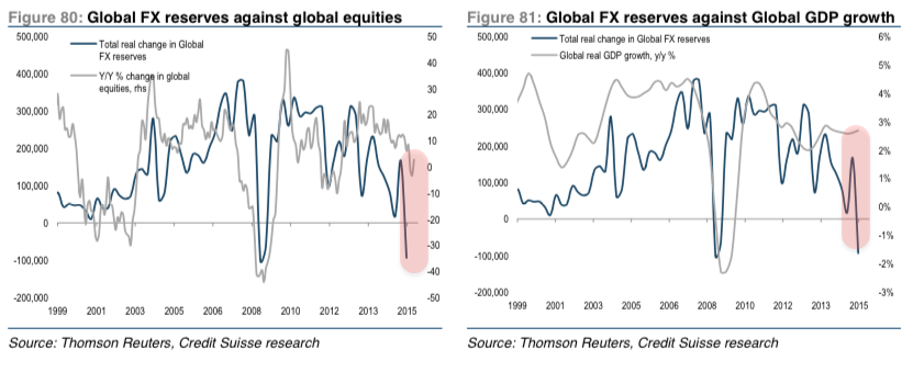
In the chart above, you
can see that the last time we saw a very sharp drop in global FX
reserves in ’08, it was associated with a sharp drop both in stock
prices and global GDP. Now,
if you look at the end of both charts, you see another sharp drop in
global FX reserves. The
growing divergence in both charts highlights another sign of growing
risk for both global stock prices and global GDP.
SHORT AND LONG-TERM DYNAMICS
CONVERGE…
Let’s wrap up for this
month. Risk has been
growing for stock prices as this year has progressed.
Now, we add in increasing risk that the global slowdown in
economic growth may develop into the next global recession.
We haven’t had one in over six years so it would not be unusual
from a time standpoint. The
various charts above as well as others I have shown recently view this
risk from a variety of angles as we don’t want to rely on any one
measure.
What is especially
interesting is that our central bank is highly likely to raise rates
next week and they are basing their decisions on mostly lagging
indicators such as the latest employment report.
If we look around the world at the other central banks, they
continue to ease more. The
ECB just expanded their money printing by around six months so they are
going to keep printing at least until March of 2017.
Draghi basically said QE is here to stay.
Not only did they expand the time of printing, but they also cut
the deposit rate further into negative territory and said that they were
going to widen the available securities they would buy with the printed
money into regional and local government bonds.
In addition to Europe,
Canada’s central bank announced today that the effective lower bound for
monetary policy in their country is -0.5%; that Canadian financial
markets could function in a negative rate environment; and that they are
ready to act. It is a
timely announcement as their economy looks to be headed into a
recession. By the way,
remember, a few weeks ago both Yellen and Dudley [the two most
influential members of our central bank] squarely put negative rates on
the table for acceptable policy here in the U.S. as they have “studied”
the effects in Europe and view that the benefits outweigh any side
effects.
The key North American
central banks are signaling that negative rates may be crossing the
ocean and coming onto our shores and Canada may be the first to strike.
As a side note, expect China to devalue their currency in the
near-future as a monetary easing; David Tepper and other prominent macro
investors expect up to a 30% devaluation.
Also, remember the
discussion on the long-term and short-term debt cycles two months ago in
my commentary. The last
peak in the short-term debt cycle was in 2007.
The average time to the next peak is around 7 to 8 years and it
has been 8 years since the last peak.
If the short-term debt cycle reconnects with the long-term debt
cycle on the way down amidst another global recession, significant
turmoil in the financial markets will reappear.
Back in late’07,
central banks around the world had not printed any money except Japan
and the Fed Funds rate was over 5%.
Essentially, the global central banks had lots of ammunition to
fight a sharp global recession and stress in the financial system.
Now, we are sitting at the zero bound with over $12 trillion of
money printed around the world by central banks and the efficacy of
incremental monetary policy has been shown to have less of an impact.
All of the extreme
monetary policies have created significant asset price inflation which
is disconnected to the reality of the underlying fundamentals.
A global recession and reconvergence of the debt cycles would act
as a catalyst for prices to reconnect with fundamentals especially as
the fundamentals deteriorate.
I have highlighted the
saying before, “It takes long for things to happen than you thought they
would, but when they happen, they happen faster than you thought they
could.” Just think back to
late 2007 and if I told you General Motors, Wachovia, AIG, Lehman
Brothers, and other companies would either go bankrupt or would be
bailed out by the government, you would have thought I had lost my mind.
At the time, these companies were showing little to no signs of
stress at all and would have been in the investment grade category of
companies. Then, in less
than a year it all happened.
We are living in a time
where debt is saturated all over the globe and the long-term debt cycle
has likely turned. In a
time of a deleveraging, things tend to happen that seem out of the realm
of possibilities. Just
think of all the financial events, economic dynamics and extreme
monetary policies since 2007.
Be mindful of the long-term macro picture and alert to the recent
developments that are emerging as rising risks can be reflected in
prices quicker than you think.
Joseph R. Gregory, Jr.