
VOLATILITY ON THE RISE
July 8, 2015
Last month, I discussed
how volatility was rising in the bond markets around the globe.
In the last few weeks, that volatility has spread to stock
markets.
The two primary global
dynamics that the market is watching is the increasing probability that
Greece may exit the European Union and more importantly, the crash going
on in the Chinese stock markets.
The decline in China has accelerated to the point where their
government is halting the trading in what Bloomberg identifies as 43% of
their entire market.
Imagine halting the stocks in 43% of the companies that trade on the
U.S. stock exchanges due to declining prices.
The Chinese have not
identified when those companies will re-open for trading.
That means that holders of those stocks are stuck and don’t know
when they will be able to get out and have no idea what the prices will
be when they re-open. Now,
consider that investors were buying Chinese stocks with record amount of
margin debt. So, many of
the holders of the stocks that have been halted own them with borrowed
money. As the overall
Chinese market declines further, it triggers more margin calls.
Since investors can’t raise money by selling the stocks that are
halted, they have to sell from the stocks that continue to trade.
That adds increased selling pressure for the overall market.
As the Chinese market
went parabolic early in the year, record amount of new trading accounts
were opened meaning that more and more people in China were piling in at
prices meaningfully above where prices are today.
This will likely create additional weakness in the Chinese
economy and we are seeing that reflected by the drop in many commodity
prices such as iron ore and copper.
MARKET WEAKNESS IS EXPANDING…
While we are seeing
increased volatility around the globe, it is still relatively muted with
the major indices in the U.S.
We have seen declines such as a day recently with the Dow
dropping around 350 points but the S&P 500 is still down less than 5%
from the highs, although both the Dow and the S&P 500 are negative for
the year. Probabilities for
further declines are increasing.
Let’s look at a few charts.
The first chart is a
chart of the S&P 500 for the last 7 months.
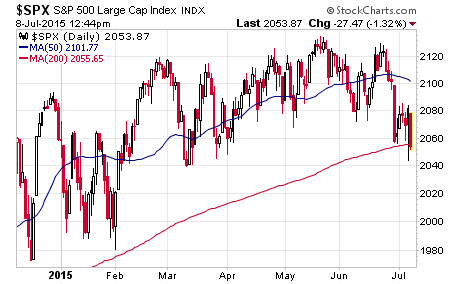
The blue line is the
50-day moving average and the red line is the 200-day moving average.
The market essentially bounced off the 200-day moving average at
the end of January. Then,
the S&P 500 dropped down to the same support line at the end of June and
tried to bounce like it did in late January.
It has retested it again a few more times in recent days.
Now, let’s look at a few more charts that suggest the odds are
increasing that the market will likely break down through this support
area and add to recent declines.
Here is a chart of the
advance-decline line which takes the number of stocks going up each day
and subtracts the number of stocks going down and runs a cumulative
number. It is one measure
of market breadth. When the
line is rising it indicates that there is broad participation among
stocks to the upside which is a healthy sign.
When it is declining, it indicates that an increasing number of
stocks are going down. This
indicator often leads the market in overall direction.
Here is this indicator over the same 7-month period.
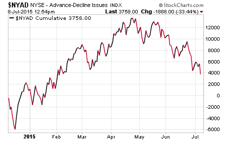
If you compare this
chart with the one of the S&P 500, you can see that the advance-decline
line peaked in late April and then the S&P 500 peaked later toward the
end of May. This line
continues to make lower lows and has not shown any signs yet of turning
back up.
Next, let’s look at
some of the more economically sensitive areas of the market.
First, here is the index of industrial companies.
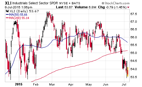
This chart shows that
the industrial index has broken through the 200-day moving average.
Now, let’s look at the materials index which are companies
involved in basic materials used in the economy.
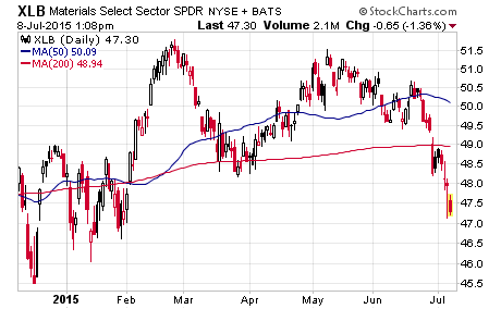
Here, we see a similar
break of the 200-day moving average.
Next, let’s take a look at the transportation index which
consists of companies that move goods in the economy.
![]()
While earlier weakness
in the transports was blamed on the airlines, weakness is spreading to
the truckers and logistics companies.
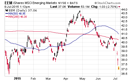
Next, let’s look at the emerging markets index which is no
surprise that we see weakness here.
Lastly, let’s look at
an all-world index which gives a picture of global markets.
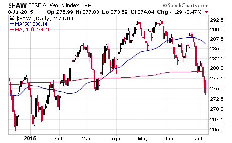
The chart shows that,
it too, has broken down through the 200-day moving average.
The 200-day moving
average is one technical trend line that market participants watch as it
is an average price of the last 200 trading days.
It provides a relative metric to compare prices across indices.
When multiple key indices are breaking down below trend lines, it
often suggests that risks are rising.
StockCharts regularly
has technical updates. One
recent update included a chart of monthly prices for the Dow and an
overlay of the monthly MACD indicator.
Without going into the details of how that indicator is created,
it is a price oscillator that compares trend lines from moving averages.
Here is the chart.
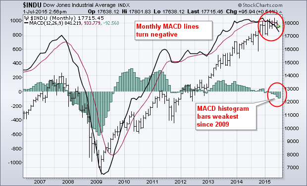
This chart goes back to
2006. The candlestick line
is the Dow, and the red and black moving average lines represent the
trend lines within the MACD indictor.
The bars on the chart represent the spread between the two trend
lines. When the market
reached a major peak in late 2007, the MACD started to turn down in a
significant way as indicated by the increasingly negative bars.
Then, when the market reached the lows in early 2009, the bars
started to turn back up and have stayed above the zero line for most of
the time since then, except for just a few months where it went slightly
negative. Now, if you look
at the end of the chart, you can see that the MACD has rolled over and
the bars are the most negative since right after the last major peak.
This indicator, just
like other technical indicators is not something to rely on by itself
but offers another clue as you put the overall big picture into
perspective.
LONGER-TERM PROSPECTS FOR THE
ECONOMY…
Now, let’s shift gears
to highlight another perspective on the economy.
Here is a brief commentary from ECRI [Economic Cycle Research
Institute] which suggests what we may see from the economy from a
longer-term perspective. I
have discussed this dynamic before but this commentary sheds additional
light on the topic.
“Recoveries have been
weakening due to declines in growth in output per hour (i.e.,
productivity), growth in hours worked, or both.
Taken together, they add up to
real GDP growth. It’s just simple math.”
“For the past four
years, productivity growth (green line) has averaged just over ½% per
year (red line), leading Fed Vice Chairman Stanley Fischer to lament
that it ‘has stayed way, way down.’
Given the latest data, one could say that the U.S. is in a
‘productivity recession,’ having seen the largest back-to-back quarterly
productivity declines in 22 years.”
“It’s often assumed
that productivity growth will rebound to its post-World War II average –
around 2¼% per year (gold line).
But you know what they say about assumptions.
To quote Fischer again, ‘productivity is extremely difficult to
predict,’ and ‘will perhaps eventually return’ to its earlier pace.
In other words, there’s no clear reason why that will happen
anytime soon. Indeed, since
the end of 2013, productivity growth has averaged minus 0.7% a year.”
“Potential labor force
growth (blue line) should reflect the long-term trend in growth in hours
worked. But the
Congressional Budget Office says it will stay at ½% per year at least
for the next decade. This
is pretty much set in stone, given the demographics.”
“Adding up the likely
trend growth of these two measures – ½% for productivity plus ½% for
hours worked – gives us just 1% longer-term real GDP growth.”
“So, unless there’s
good reason to believe that productivity growth will revive, trend GDP
growth may very well stay stuck in the 1% range for years to come.
If so, growth slowdowns could much more easily push growth below
zero, leaving very little room for error.
Is the Fed ready?”
This perspective by
ECRI suggests that economic growth will remain muted if productivity
does not rebound in a notable way since demographics indicate that the
long-term trend in the growth in hours worked is likely stuck at ½% per
year. Since the last
recession in 2008, capital spending has been relatively weak as
companies use capital to buy back stock rather than invest in capital
equipment. This is based
partly on their outlook for return on capital and the uncertainty
throughout the economy. The
weak capital spending will likely continue to keep productivity
relatively weak.
This leads to a quick
comment on the Fed. Given
all the uncertainty around the globe such as with Greece and China and
the increasing volatility in financial markets, I continue to think the
Fed will not raise rates this year.
Couple the volatility with continued muted economic growth and
they will rationalize to remain on the zero bound.
They want to make one quarter point hike just to get off zero,
but they will likely be too afraid to move.
ANOTHER AREA OF EXCESS…
As I close this month,
I want to highlight another growing issue in the economy that is a
result of this ultra-easy Fed policy.
It is in the car market.
Here is a highlight from Bloomberg; “Demand for automobile debt
in the U.S. is enabling lenders to make longer loans to people with
spotty credit, stoking concern that car shoppers are being lulled into
debt loads they won’t be able to sustain.
Of the subprime vehicle loans bundled into securities, 73 percent
now exceed five years, up from 64 percent during the first three months
of 2014, according to data from Citigroup Inc.
Loans as long as seven years are increasingly being put into more
bonds as auto-finance companies and Wall Street banks sell the
securities at the fastest pace since 2007.”
Sound familiar to the
housing market in 2006? All
the buyer cares about is the monthly payment, and zero rate Fed policy
coupled with extending the term allows you maintain “affordability.”
All the banks and auto-finance companies care about are the
origination fees and Wall Street gets the securitization fees in the
process. And, investors
relax their guard and rationalize buying the loans in the search for
yield. A similar dynamic is
in place as the housing market; now we get to see just how far it will
go! Once again, we see a
Fed policy that encourages debt, creates moral hazard, fosters an
unhealthy appetite for risk by savers, and enables the enablers to scalp
fees in the process of origination/securitization.
When this blows up, the bailouts will come once again and will
make the “cash for clunkers” program back in the last recession look
like nothing.
Let’s close for this
month. Volatility is
growing in the financial markets around the globe.
Risk is rising as evidenced by a number of charts that I
discussed. Between now and
the end of October is traditionally the more volatile time of the year.
And, we are just entering earnings season which should highlight
continued muted economic growth.
But have no fear; we still have the Federal Reserve to protect
us, right?
Joseph R. Gregory, Jr.